A client approached me for a site for their business. What they wanted was very specific so I had to build it from the ground up.
On the initial build, they were not happy with some of the spacing - which could easily be fixed - but mostly the font weights. There was no real way to match the fonts they wanted - they were not web-safe.
A suggestion was made to have images as the background with text overlayed on those images. I immediately knew this would not work, but for some reason, I went and did it.
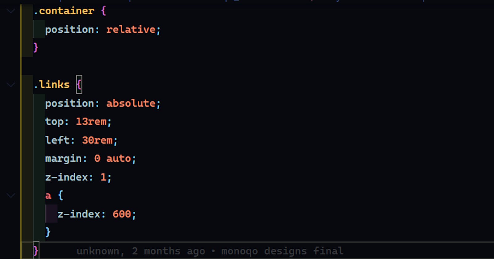
I had a CSS file filed with position: relative;, position: absolute;, transform: translate() and z-index to position the text correctly on all screen size. This still did not achieve the desired result.
when your CSS starts looking like this, it's a clear indication that something is amiss:

In the end, I went back to the initial build. Modified it and found a font that wasn't an exact match but close enough.
This refactored build got a thumbs up from both the client and some people I had a call with.
Remember: You are the developer, you know what works and what doesn't.

